COVID-19
Impact on Anxiety and Depression

Description
This project was developed for the Visual Analytics course at RIT Croatia.
The main goal was to let the data speak — crafting visualizations that require no explanation. Visual immediacy and clarity were fundamental design principles throughout the entire process.The analysis focused on the global mental health impact of COVID-19, particularly depression and anxiety.
Open-source datasets were integrated and analyzed to uncover trends across age groups and income levels using interactive dashboards.Key findings include:
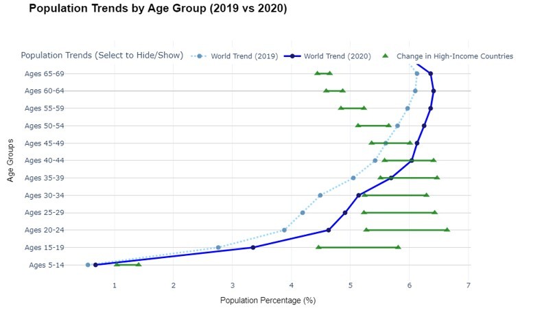
Young people in high-income countries were the most psychologically affected by the pandemic.
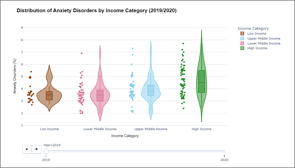
Anxiety and depression spiked after 2020, especially among individuals under 30.
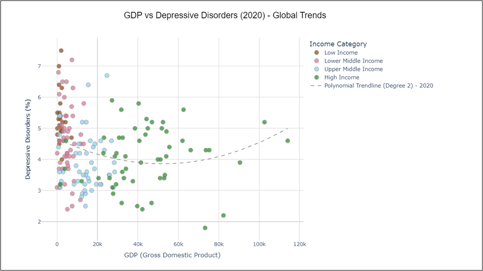
Depression rates decrease with rising income, but start climbing again beyond a certain wealth threshold — forming a U-shaped curve visible in GDP scatterplots.
Visual evidence also showed that air pollution and technology overuse may correlate with higher mental distress in certain regions.
Overall, the project shows how well-designed data stories can surface complex socio-economic patterns and offer actionable insights.
Tools
I began with Excel for basic data exploration and merging multiple sources. The next step was using Python, where I relied on Pandas for data cleaning and Plotly and Seaborn for generating exploratory and comparative visualizations.
Plotly allowed for interactive graphs to explore trends dynamically.
Seaborn was useful for quick correlation plots and category-based comparisons.
Power BI was used to build the main dashboard, offering an accessible and user-friendly way to filter and explore the data.
I also experimented with D3.js for more advanced and fully customizable web-based visualizations.
As always, the core of the project was a solid and coherent data structure — everything was built upon clean, well-merged datasets to ensure meaningful and accurate insights.